More and more people surf the web & look at photos on their phones. Looking at your visitor stats in Sytist you will see how many visitors are on mobile, tablet or computer.
Sytist is great for mobile users because of it's responsive design, but if your header or logo is too large, it could "squish" the pages and make them hard to view on a mobile device.
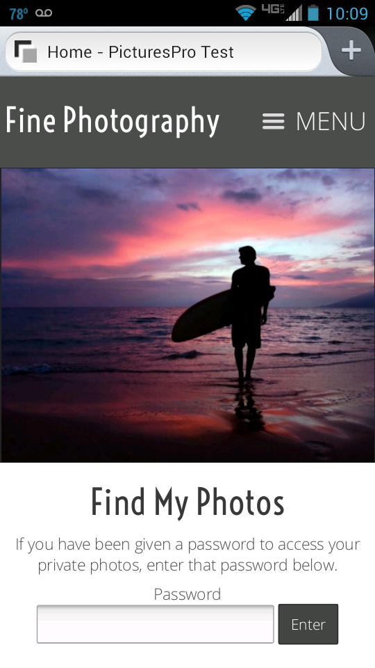
In one of the recent updates a new mobile header section was introduced.
You can use either text in the text editor or upload a small logo file. Max the maximum width 220 - 260 pixels for the logo file. This way there is still room for the mobile menu.
In your Sytist admin, go to Design -> Header & Footer. Click on the Mobile Header tab. There you can either enter in text or upload your logo file. Then click the enable mobile header option and save.
Mobile Menu Tweaks
The way the mobile menu kicks in changed some with the Sytist 1.4 update. As it is by default, the mobile menu will kick in when the screen resolution is 800 pixels wide or smaller.
If you want the mobile menu to kick in at a higher resolution, you can edit your theme (Design -> Edit My Theme), click Additional CSS in the left menu and add the following code. This will make the mobile menu kick in at 1024 pixels wide,
If menu is placed under the header
@media (max-width: 1024px) {
#topMainMenuContainer { display: none; }
#mobilemenubutton { display: block; }
#mobilemenu { display: block; }
}
if menu placed other than under the header (left right of header)
@media (max-width: 1024px) {
#topMainMenuContainer { display: none; }
#mobilemenubuttontop { display: block; }
#mobilemenu { display: block; }
}
The mobile menu icon to tap displays in the upper right corner of the screen. You may want to make a tweak to give it more spacing on the top or bottom so it aligns in the middle. You can use the following code in the additional CSS section of your theme to start with. You may need to adjust the 12px value.
To add more spacing top / bottom for the mobile menu icon
@media (max-width: 1024px) {
#topMainMenuContainer { display: none; }
#mobilemenubuttontop { display: block; margin-top: 12px; }
#mobilemenu { display: block; }
}