The "Footer" is shown at the bottom of all your pages. Generally the links are the same as what you have in your menus.
Header
There is also an option to simply upload a logo file when in the Header & Footer tab.
If using a logo file, the size of your logo file depends on your theme and the space in the header. Generally you don't want the logo file too large. 80 pixels in height is a good place to start. After you have added a logo to your header, go to Design -> Edit My Theme and make adjustments to the header section if needed.
Mobile Header
The mobile header option allows you to have a different (smaller) logo / header when showing on mobile devices or devices with a screen resolution less than 800 pixels wide. It is best to upload a small logo here or just enter in text so it doesn't make the pages "squished" if you main logo is too large.
The suggest max width for the mobile logo or header is 250-280px, but you may want to experiment on size.
Editor Style (advanced users)
External Header & Footer Files (advanced users)
Footer
Content listing layouts
Page display layouts
Codes and details (advanced users)
Listing Layouts
<?php listingTitle($page); ?> = Page title with link to page
<?php listingTitleOnly($page); ?> = Page title only
<?php listingTotalPhotos($page); ?> = Total photos for page
<?php listingDate($page); ?> = Page date
<?php listingTime($page); ?> = Page time
<?php listingPrice($page); ?> = Product price
<?php listingExpireDate($page); ?> = Page expiration date
<?php listingCategories($page); ?> = Categories page assigned to
<?php listingPreviewText($page); ?> = Preview text or snippet of page
<?php listingFullText($page); ?> = Complete text of page
<?php listingPhotos($page); ?> = Listing all photos from page
<?php listingFirstPhoto($page); ?> = Showing first photo from page
<?php listingAddToCart($page); ?> = Add to cart link for products
Page Display Layouts
<?php pageExpireDate(); ?> = Expiration date
<?php pageDate(); ?> = Date
<?php pagePhotos(); ?> = Where the photos of the page are displayed
<?php pageText(); ?> = Text of the page
<?php pageTags(); ?> = Tags for the page
<?php socialShare();?> = Social share options (facebook like, pinterest, etc...)
<?php pageCategories(); ?> = Category the page is in
<?php pageNextPrevious(); ?> = Next & Previous menu
<?php pageHomeFeatured();?> = Used for the home page to display featured content
<?php productCart();?> = Add to cart / product options.
Adding a search link
Billboards are like a slideshow you can add to the home page, sections, categories or other pages that show at the top of the pages. These are great to add to the home page.
You will upload photos to create the slides and then you have the option to add text to the slides. After you have created a billboard, to add it to the home page go to Site Content -> Manage Home Page and click the Billboard option. To add it to a section or category, go to Site Content and edit under your section name.
Creating a new billboard
Site Design -> Billboards, Click the Create New Billboard tab. Give a new for your reference.
Placement
- Inside page content container (fixed width / height ratio)
This will place the billboard INSIDE the padded content area of the page. Above the page title and other stuff. - Below menu & above page content container (fixed width / height ratio)
This will place the billboard directly below the main menu / header and above the page content container. With this option you also have the option to make it 100% wide on the screen. - Full Screen (New starting with Sytist 2.1)
The full screen option will make the billboard fill the screen completely on all devices. This can be useful to use for your home page for a nice effect. Full screen has a couple of different option available. See below for details.
Height
For the first 2 options above , this sets the height of the billboard area based on a 1024 pixel width.
Because of the responsive design of Sytist, the billboard will adjust
to the screen resolution so the height will actually grow larger on
higher resolution screens and smaller on smaller ones. This keeps the
dimensions the same no matter when it is being viewed.
Seconds between slides
This sets how long to display each slide.
Transition Speed
How fast the slides fade in / out.
Add slow zoom in / out effect to photos (starting with Sytist version 2.1)
With this option selected, the photos will alternate zooming in and out slowly.
Loop the slides
Check this if you want the billboard to start over when it reaches the last slide.
Padding, Border Color & Border Size
Padding adds padding to the outside of the billboard display area and the border option is the border around the billboard.
Show small navigation buttons
When there are more than one slide, the navigation numbers can show for the view to click on to select a slide to see.
Uploading photos to use for slides
Once you have created your billboard you will then need to upload
the slides. You will need to upload landscape (horizontal) photos for
the slides. Click the Upload Slides tab or link. You can either select
photos from your computer to upload or select from existing photos in
your all photos section.
Once you have uploaded the photos, you can then add text to them if you like.
Adding text to slides
You can add text to the billboard slides (photos) for each slide. It is recommended to NOT add text to billboard slides when using the Full Screen option. The text will not resize proportionally. If you do, only add one line.
To do so, click on the thumbnail of the slides you want to add text to. The slide editor will open up. Click the Add Text link below the photo.
You will see a new text block added (Click to edit). Click in there to change the text. When you mouse over the text a dot will appear to the upper right of it. Use that to move the text around to where you want it to be.
You will notice when you add new text or click on existing text, a menu will appear where you can adjust the text color, fonts, size, etc...
You also have the option to select from several animation for when the text appears. When you change the animations you will see a preview of it. To preview animations of all elements you have added, click the preview animations link.
The animations runs one after another starting with the first element you add. So the first text or graphic you add will be the first to show, and the last one will be the last.
Be sure to click Save when you are done with editing your slide.
Adding a billboard to a section or page
When editing a section, category or page, you will see a Billboard option. You can select the billboard to use there.
Calculating billboard photo sizes for the fixed width / height ratio options.
The width of the billboard adjusts to the screen width of the display area of the page. When editing a billboard it is set to 1024px, so the default is 1024 x 250 (if the height is set to 250).
But they will be displayed larger or smaller depending on the visitor screen resolution and device. The largest is going to be the max width of your theme (1600 by default).
SO ... to figure out the best size to fit your billboard with little or no cropping, take the height you set for the billboard divided by 1024 ... 250 / 1024 = .244
Then 1600 * .244 = 390
Size to create 1600 by 390
Full Screen Billboard Options
There are a couple of additional options when using the full screen option which can be selected when previewing the billboard. Click here to view a full screen billboard in the demo. To manage these options, click the Preview Billboard tab.
1) Link Buttons
Link buttons can be added to link to sections of your website which stay in place as the photos change. You can stylize the link buttons to change the color and look of them.
2) Parallax Effect
With this option selected, when you scroll down the page, the billboard photos will scroll at a different rate on desktop giving it a nice effect. This option does not display on mobile because of performance.
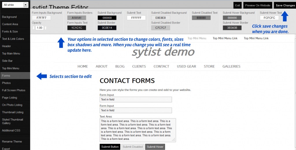
There are many areas of the website that shows default text / language. This section allows you to change that text.
If there is a certain word or phrase you are wanting to change, hold down the CTRL button on your keyboard and press F. This will bring up the find feature on your browser. Type in the word you are looking for.
Starting in Sytist version 0.7.9 is a new display feature called the "CLF-Display". This feature is available from the home page and also in each section / category.
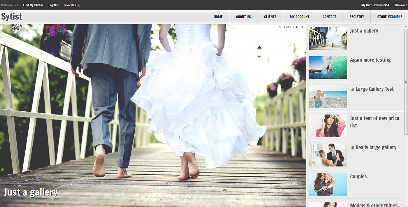
The CLF-Display is designed to show full-screen a slideshow of the pages in the section or on the home page pages from section you select from ... or photos assigned to the home page. Down the right side of the page also lists those pages (optionally).
This feature will display best using a small header with the menu set to the left or the right. There are 2 new themes in this Sytist update that work best with the CLF Display.
Click here to view the demo home page using the CLF-Display and a theme that works well with it.
Here is a video tutorial going over the new CLF-Display feature.
To add the CLF-Display to the home page, go to Site Content -> Edit Home Page and click the CLF-Display tab.
To add the CLF-Display to a section, edit the section and click the CLF-Display tab.

Loading more pages