This is how to create responsive columns for content to add to your home page or any page.
Enter in your text here. Enter in your text here. Enter in your text here. Enter in your text here.
Enter in your text here. Enter in your text here. Enter in your text here. Enter in your text here.

Enter in your text here. Enter in your text here. Enter in your text here. Enter in your text here.
Enter in your text here. Enter in your text here. Enter in your text here. Enter in your text here.

Enter in your text here. Enter in your text here. Enter in your text here. Enter in your text here.
Enter in your text here. Enter in your text here. Enter in your text here. Enter in your text here.
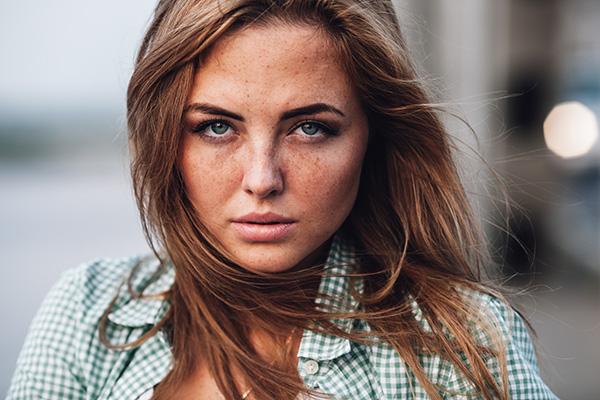
If you want an image in each column, create those images first. You will need to size them about 600 - 800 pixels wide and have them all have the same height. In the above example, the photos are 600 x 400.
Upload those photos into Design -> Misc. Images & Files section. After the images have uploaded, click the "get links / code" link. You will want to copy the "local link" for each one to add to the code.
Copy the code below and on the page you want to add the columns to, click the < > HTML icon in the text editor and paste it into there. For the images, replace the img src links with the links to your images.
Example, replace
in the code with your image local link /sy-misc/image1.jpg .
After you have changed the image links, click Save Changes. Then you will be able to replace the text with your text.
If you want 2 columns, start with this code:
<div style="width: 50%;" class="left nofloatsmall"> <div style="padding: 8px; margin: 8px; "> <div><img src="https://s3.us-east-2.amazonaws.com/picturespro/col1.jpg" style="width: 100%; height: auto;"></div> <div style="padding-top: 16px;"> <p>Enter in your text here. Enter in your text here. Enter in your text here. Enter in your text here. </p> <p>Enter in your text here. Enter in your text here. Enter in your text here. Enter in your text here. </p> </div> </div> </div> <div style="width: 50%;" class="left nofloatsmall"> <div style="padding: 8px; margin: 8px; "> <div><img src="https://s3.us-east-2.amazonaws.com/picturespro/col2.jpg" style="width: 100%; height: auto;"></div> <div style="padding-top: 16px;"> <p>Enter in your text here. Enter in your text here. Enter in your text here. Enter in your text here. </p> <p>Enter in your text here. Enter in your text here. Enter in your text here. Enter in your text here. </p> </div> </div> </div> <div style="clear: both;"></div>
If you want 4 columns, start with this code:
<div style="width: 25%;" class="left nofloatsmall"> <div style="padding: 8px; margin: 8px; "> <div><img src="https://s3.us-east-2.amazonaws.com/picturespro/col1.jpg" style="width: 100%; height: auto;"></div> <div style="padding-top: 16px;"> <p>Enter in your text here. Enter in your text here. Enter in your text here. Enter in your text here. </p> <p>Enter in your text here. Enter in your text here. Enter in your text here. Enter in your text here. </p> </div> </div> </div> <div style="width: 25%;" class="left nofloatsmall"> <div style="padding: 8px; margin: 8px; "> <div><img src="https://s3.us-east-2.amazonaws.com/picturespro/col2.jpg" style="width: 100%; height: auto;"></div> <div style="padding-top: 16px;"> <p>Enter in your text here. Enter in your text here. Enter in your text here. Enter in your text here. </p> <p>Enter in your text here. Enter in your text here. Enter in your text here. Enter in your text here. </p> </div> </div> </div> <div style="width: 25%;" class="left nofloatsmall"> <div style="padding: 8px; margin: 8px; "> <div><img src="https://s3.us-east-2.amazonaws.com/picturespro/col1.jpg" style="width: 100%; height: auto;"></div> <div style="padding-top: 16px;"> <p>Enter in your text here. Enter in your text here. Enter in your text here. Enter in your text here. </p> <p>Enter in your text here. Enter in your text here. Enter in your text here. Enter in your text here. </p> </div> </div> </div> <div style="width: 25%;" class="left nofloatsmall"> <div style="padding: 8px; margin: 8px; "> <div><img src="https://s3.us-east-2.amazonaws.com/picturespro/col2.jpg" style="width: 100%; height: auto;"></div> <div style="padding-top: 16px;"> <p>Enter in your text here. Enter in your text here. Enter in your text here. Enter in your text here. </p> <p>Enter in your text here. Enter in your text here. Enter in your text here. Enter in your text here. </p> </div> </div> </div> <div style="clear: both;"></div>