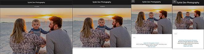
The advanced page design allows you to design your home page, pages & blog posts with design elements such as columns, buttons, hero/billboard photos with text overlays, slideshow, video and more. There are also 7+ page templates to get you started.
The demo home page was made with the page designer, and you can view stock templates in the demo here.
Where is it?
Design -> Page Templates you will find a list of stock templates. From there you can preview and edit the templates.
For individual pages, when editing the page in the admin, under the basic text editor click "Advanced Page Design". This will open the page designer where you can add elements and load templates.
To add a template you have created to a page, edit that page in the admin you want it on, click the advance page design link, then in the templates menu, click load next to the one you want to add to the page. After you have loaded the template, you can save and it will add the content of that template to the page you are editing.
Tip: To play around and test out the page designer, create a new Top Level Page in the Site Content section and click the Advanced Page Design link there to get into the designer. If you create a design you want to use on another page, you can save it as a template then load it the other page.
Adding Design Elements
When in the page editor you have an Add Design Element button at the bottom of the screen. When you click this, a list of categories will open on the left of the screen. Some of the options include Header & Text, Columns, Hero/Billboard Photos, Video, Map and more. When you select a category, you will see a list of design elements to choose from.
Select a design element by clicking and dragging it onto the page. Once you start to drag, you will have highlighted areas where you can drop the element. You will also have the option to rearrange the placement of the element with the move option when mousing over it.
Row Styling Options
Each element you add to the page has row styling options. This controls much of the look of the element such as size, color, alignment, etc... You will see this option along with move, delete, duplicate, etc... when you mouse over the element.
Below are options when editing the row styling of a design element. Not all options are available for all design elements. Some may have a couple of options where some may have 12 or more options.
BG Width - The width of the outer background container mainly used if using a colored background behind the design element.
BG Color - The color of the background outer background
Content Width - The width of the row of content. Options are:
- Screen Width: fills the entire screen edge to edge
- 100%: fills the page content area
- 1400, 1200, 1024 & 800 pixels maximum width
BG Pad T/B - If using a colored background, this sets the top & bottom padding around the content.
BG Pad L/R - If using a colored background, this sets the left & right padding around the content.
Column Color - Adjusts the color of the photo columns.
Border Size - The size of the border around photo columns.
Border Color - The color of the border around photo columns.
Photo Padding - Padding in photo columns around the photo and text under it.
Text Pad - The padding of the text only under a photo in a photo column.
Text Align - The alignment of the text: left, center, right & justify.
Photo Ratio - Adjusts the ratio of the photo.
Size Spacing - The size & spacing of columns.
Bottom Margin - The margin / spacing below the row of content.
Top Margin - The margin / spacing above the row of content.
Pixel Height vs View Height
Some elements you will have the option for Height Pixels & Height VH which VH stands for View height.
Pixel height is a set fixed height for the photo or element. Where view height sets the height based on the screen size.
A view height example lets say you set it to about half the screen height. On all devices, it is going to be half the screen height no matter view device size or orientation.
If you are using pixel height and set it to about 500 pixels, it is going to be 500 pixels high on all devices. So it might look like half the screen on your computer, but on a mobile device, it might cover more area.
Which to use?
If you are just adding one line of text over a photo or no text, view height will probably be best. If you are adding multiple lines of text over a photo, pixel height will probably be best.
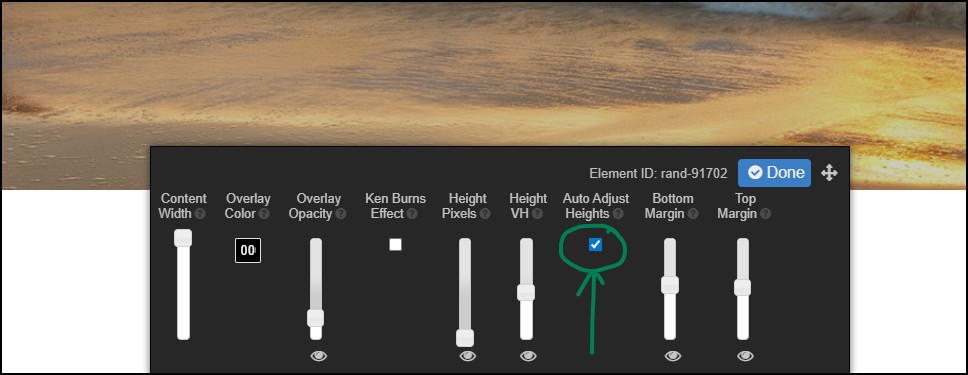
Auto Adjust Heights
New for Sytist 5.6
This option is available when editing the row stylings for hero / billboard design elements. What this does is automatically creates break points to adjust the height of the element to the screen size. So the smaller the screen size, the shorter the height in an attempt to keep the ratio similar.
When you design the page on a computer, your screen resolution is on average around 2000 pixels in width. So when the page is viewed on smaller screens, the element fills and the sides are cropped off.
Checking this option the element height will adjust as follows:
- <=1024 pixels in width: 80% of current value
- <= 800 pixels in width: 60% of current value
- <= 480 pixels in width 40% of current value
The option is the Auto Adjust Heights checkbox when in the Row Stylings of the element.
Note this doesn't automatically apply to existing billboard elements. You will need to edit the element, check the box and save.
Video Options
You can add responsive videos to pages either by uploading your own video file or embedding from YouTube or other services. You can place a video centered on the page, split with text on one side and video on the other, or make a video background element which you have the option to add text overlay.
Once you add a video element to the page, mouse over the element and click Row Styling to upload or add your video.
Embed Code
This is used to embed video from YouTube or other video services. You would copy the embed code they offer and paste it into this section.
Video Link
This is where you upload your own video file. Videos should be in a MP4 format. You will see on the upload button the maximum file size you can upload. Example: < 30MB which means the file will need to be less than 30MB in size. This value is based on the PHP settings on your hosting.
If your video file is larger than that, you will need to upload that video file via FTP to your server and enter in the link in the field provided. You can also upload your video file to Amazon S3 or another cloud storage and enter in that link in the field provided.
Poster File
This is the photo that is shown in the video before you press play.
Video Link Options
These options only apply when you upload your own video file, not the embed video option. You can choose to autoplay, loop, mute and no controls.
Video Background Option
When using the video background, the video is going to fill the container it is in so some cropping will occur. Video backgrounds are also set to autoplay, muted, loop and no controls.
Maps
You can add a Google Map to a page with a marker at your location by selecting Maps in the design elements . It can be a map that fills the row or split like this. Just add the map design element to the page, click Row Styling and enter in your full address in the address field.
Dynamic Content & Forms
Dynamic Content
This is going to display content (pages or galleries) from a section on your website. You can use this to display recent galleries, recent blog posts, etc...
Once you add the dynamic content element to the page, select Row Styling to select the section or category you want to show content from. There are also options to style that content, select to show date, expiration date, preview text and more.
Forms
You can create contact forms in the Forms section of your Sytist admin and display those forms in the page designer. Once you add a form element to the page, click Row Styling to select which form to use.
Creating a Page Design Without Effecting the Content of the Existing Page
You can create a page design without effecting the page you want it on until you have the design ready by creating your own template. While in the page design editor (Site Design -> Page Templates), select a stock or blank template and save it as a new template and then you can edit that template.
Once you have your template the way you like, go to the page in the admin you want that template content to be on and click the advance page design link. In the page designer, click Template and click "+ Load" to load that template content onto that page. When you save after that, it will make the content of that page what is in the template. Then you can make changes to the page as you like.
How To Tell If You Are Editing a Template or a Page
Since you are editing the page design on your website, it might be hard to tell if you are editing a "Template" or editing the "Page" content.
At the bottom of the screen, the upper left of the editor menu will show you.

Editing page content

Editing a template