This is how you can adjust the hero / billboard elements made with the Page Designer to better fit the screen and phones.
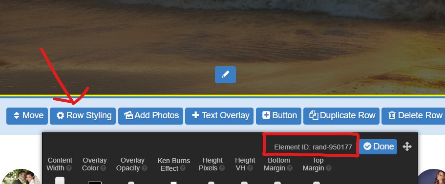
First you need to get the element ID. To do so, edit the page with the page designer, mouse over the billboard and click Row Styling. It will show you the element ID.
Next go to Design -> Edit My Theme then Additional CSS in the left menu.
Copy the following code and paste into the Additional CSS section and replace the rand-123456 parts with the element ID it shows you in the page designer. Then save.
@media (max-width: 1200px) {
#rand-1234{ height: 50vh !important; }
}
@media (max-width: 1024px) {
#rand-1234 { height: 40vh !important; }
}
@media (max-width: 800px) {
#rand-1234 { height: 30vh !important; }
}
@media (max-width: 640px) {
#rand-1234 { height: 25vh !important; }
}
Testing It
View the page with the billboard on your computer and resize your browser changing the width. You should see the height of the billboard change as the browser gets narrow and wider.
Adjusting the values
You may want to adjust the values in the code so it is taller or short.
The pixel sizes (1200px, 1024px, etc...) is saying "When the screen resolution gets smaller than XXpx, change the height of the element to this.
You can set the height value to pixels or view height (the vh) which vh is the percentage of the height of the screen.