To post a new support question, click the Post New Topic button below.
Current Version: 5.3.4 | Sytist Manual | Common Issues | Feature Requests
How To Make Images In The Content Area Responsive?
Currently, images that are inserted into the content area of a page do not scale on mobile or smaller screen sizes. How can I make it so images do not exceed the maximum width of the page?
If you use the page designer, you won't have that issue.
Otherwise, if this is for standard pages you can to Design -> Edit My Theme -> Additional CSS and add this line of code:
#blogPage .text p img { text-align: center; margin: auto; display: block; max-width: 600px; width: 100%; }
My Email Address: info@picturespro.com
This was being used for a #standardPage, but that worked.
I would like to use Page Designer, but unfortunately it's really not useful for my case use. I'm using Wordpress for all the sales and marketing pages because the website is huge and involves a lot of customized features like location and vendor directories, and things that just aren't possible or would be overly complicated to manage in Sytist. I use Sytist exclusively for the client galleries and shopping cart pages, which is what it's best at. All of those kinds of pages are locked into templates that are tricky to modify, though. I would really need, and honestly would love, a true page designer tool that allowed various bits of content (e.g., featured image, gallery listing, add to cart button, etc etc etc) to be constructed with page builder, similar to the way that Elementor's Template Builder works. Just a blank canvas that has widgets for all the template page's features, and the ability to drag, drop and style into my own template pages.
How can I get the main image on store pages to not be locked into the square ratio of the .photos div? I'd like images in this case to fill the full width of the left hand column.
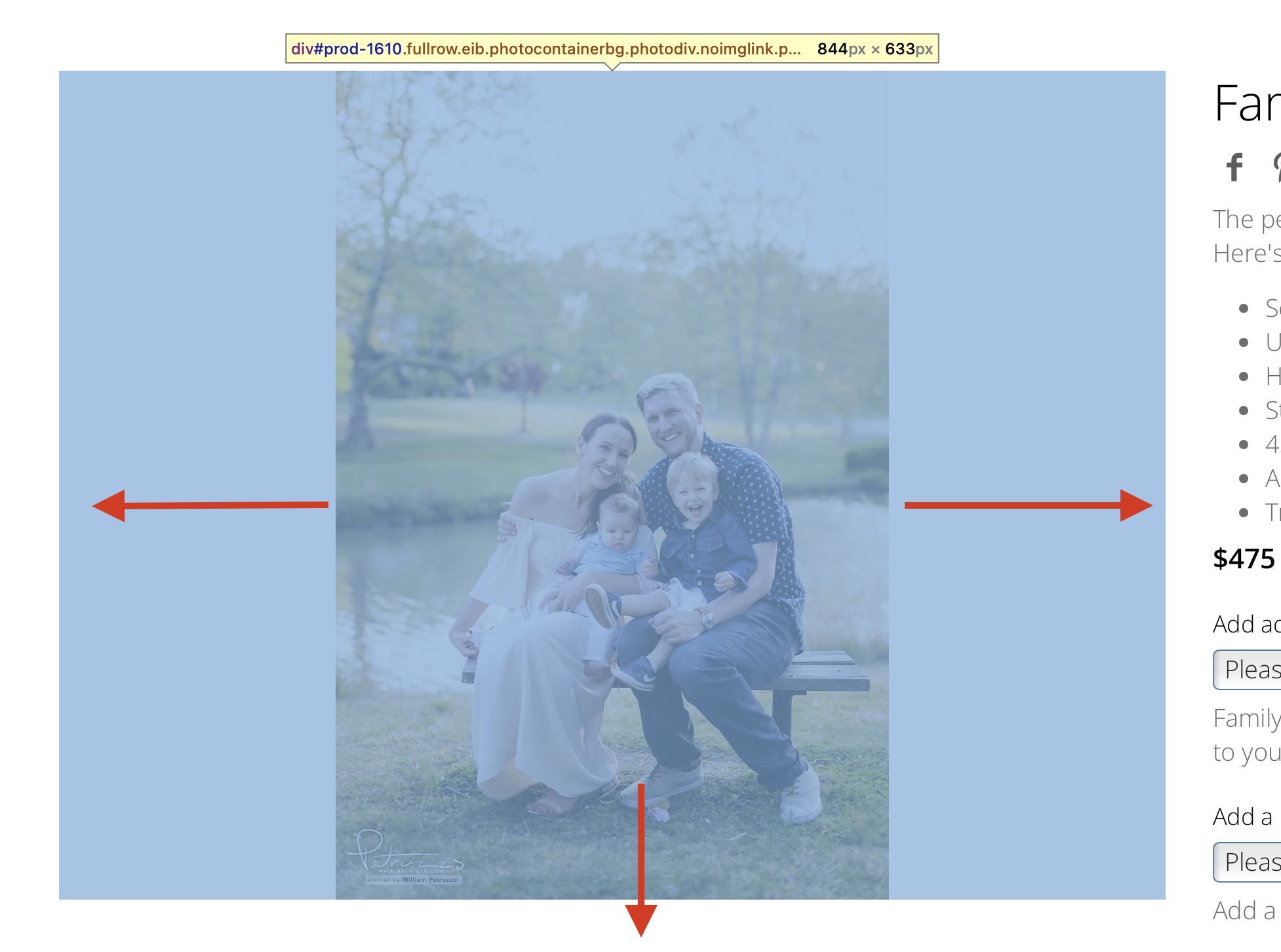
Go to Design -> Page Display & Content Listing Layouts and you would need to edit Store Pages under Page Display Layouts to change that.
My Email Address: info@picturespro.com
I've done some digging on this page and cannot figure out how to affect this aspect of the page. It seems to have something to do with the inline style since that's the only code that seems to make an effect on the image. I'm assuming this is generated by a script somehow, but I don't know.
style="width: auto; height: 633px; margin-top: 0px; margin-left: 210.789px;"
It seems like, or acts like, the .inner class has a defined width/height ratio and the image is always contained within that div. What I really want is the image to fill the entire width of the .inner div and the heigh to be whatever is necessary for the image.
The photo area is being resized to a .75 ratio (like 800x600 for example) with JavaScript. Sorry, but there is not a way to change it.
My Email Address: info@picturespro.com
Ok, thanks. Any plans in the pipeline for a big refresh of the Sytist software?
I would easily pay at at least 50% more than the current price for almost exactly the same system designed to piggyback on Wordpress' CMS features.

Loading more pages