To post a new support question, click the Post New Topic button below.
Current Version: 5.5.2 | Sytist Manual | Common Issues | Feature Requests
Please log in or Create an account to post or reply to topics.
You will still receive notifications of replies to topics you are part of even if you do not subscribe to new topic emails.
Responsive Mobile On Powerful Smartphones
M
Marco B
262 posts
Sat Dec 27, 25 2:35 PM CST
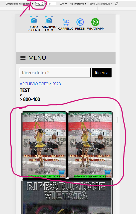
Good morning, I've noticed that many recent smartphones have high base resolutions, and the site's responsiveness changes the view on smartphones from 2 to 3 columns in "justified" mode, making vertical photos too small.
My little Pixel8 displays 3 columns, and the photos are too small.
Can I add some CSS code to raise this limit or to always set it to two columns on mobile?
Thanks
This reply was deleted.
M
Marco B
262 posts
Sat Dec 27, 25 2:40 PM CST
attach
Attached Photos

Tim - PicturesPro.com
17,569 posts
(admin)
Mon Dec 29, 25 4:20 AM CST
Sorry, can't think of a way to change that.
Tim Grissett, DIA - PicturesPro.com
My Email Address: info@picturespro.com
My Email Address: info@picturespro.com
Please log in or Create an account to post or reply to topics.

Loading more pages