To post a new support question, click the Post New Topic button below.
Current Version: 5.5.2 | Sytist Manual | Common Issues | Feature Requests
Please log in or Create an account to post or reply to topics.
You will still receive notifications of replies to topics you are part of even if you do not subscribe to new topic emails.
Could "delete All" Button Be Further Away From The "next Page" Button?
Michael Leenheer
557 posts
Fri Sep 26, 25 9:57 PM CST
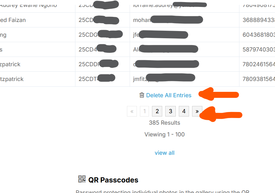
On the page that lists QR passcodes, the link to "Delete All Entries" is right on top of the 'go to next page' buttons.
When viewing on mobile, especially, this is a bit close for comfort. A fat-thumbed unthinking employee could reset the whole job. Of course I'm totally not talking about myself ... (heh)
I know there's a confirmation dialog but leaving more space or moving the "Delete All" to a menu option at the top would feel safer.
Thanks for considering.
Attached Photos
Michael Leenheer || My Sytist: https://subphoto.ca/client_galleries/demo01/
Please log in or Create an account to post or reply to topics.

Loading more pages