To post a new support question, click the Post New Topic button below.
Current Version: 5.4.1 | Sytist Manual | Common Issues | Feature Requests
Please log in or Create an account to post or reply to topics.
You will still receive notifications of replies to topics you are part of even if you do not subscribe to new topic emails.
Css For Html Emails
Joey Freeman
322 posts
Thu Mar 28, 19 10:26 AM CST
Hey Tim,
Is it be possible to have additional CSS just for HTML emails that i create as templates? I would assume if I put it into the additional CSS section that it would effect the entire website.
Thanks.
Is it be possible to have additional CSS just for HTML emails that i create as templates? I would assume if I put it into the additional CSS section that it would effect the entire website.
Thanks.
Joey Freeman
322 posts
Thu Mar 28, 19 11:16 AM CST
Just to follow up with this, it looks like it reads the first 2 style types that it reads but stops at @media
Download images are ready
@media only screen and (max-width:600px) {p, ul li, ol li, a { font-size:16px!important; line-height:150%!important } h1 { font-size:30px!important; text-align:center; line-height:120%!important } h2 { font-size:26px!important; text-align:center; line-height:120%!important } h3 { font-size:20px!important; text-align:center; line-height:120%!important } h1 a { font-size:30px!important } h2 a { font-size:26px!important } h3 a { font-size:20px!important } .es-header-body p, .es-header-body ul li, .es-header-body ol li, .es-header-body a { font-size:16px!important } .es-footer-body p, .es-footer-body ul li, .es-footer-body ol li, .es-footer-body a { font-size:16px!important } .es-infoblock p, .es-infoblock ul li, .es-infoblock ol li, .es-infoblock a { font-size:12px!important } *[class="gmail-fix"] { display:none!important } .es-m-txt-c, .es-m-txt-c h1, .es-m-txt-c h2, .es-m-txt-c h3 { text-align:center!important } .es-m-txt-r, .es-m-txt-r h1, .es-m-txt-r h2, .es-m-txt-r h3 { text-align:right!important } .es-m-txt-l, .es-m-txt-l h1, .es-m-txt-l h2, .es-m-txt-l h3 { text-align:left!important } .es-m-txt-r img, .es-m-txt-c img, .es-m-txt-l img { display:inline!important } .es-button-border { display:block!important } a.es-button { font-size:20px!important; display:block!important; border-width:10px 0px 10px 0px!important } .es-btn-fw { border-width:10px 0px!important; text-align:center!important } .es-adaptive table, .es-btn-fw, .es-btn-fw-brdr, .es-left, .es-right { width:100%!important } .es-content table, .es-header table, .es-footer table, .es-content, .es-footer, .es-header { width:100%!important; max-width:600px!important } .es-adapt-td { display:block!important; width:100%!important } .adapt-img { width:100%!important; height:auto!important } .es-m-p0 { padding:0px!important } .es-m-p0r { padding-right:0px!important } .es-m-p0l { padding-left:0px!important } .es-m-p0t { padding-top:0px!important } .es-m-p0b { padding-bottom:0!important } .es-m-p20b { padding-bottom:20px!important } .es-mobile-hidden, .es-hidden { display:none!important } .es-desk-hidden { display:table-row!important; width:auto!important; overflow:visible!important; float:none!important; max-height:inherit!important; line-height:inherit!important } .es-desk-menu-hidden { display:table-cell!important } table.es-table-not-adapt, .esd-block-html table { width:auto!important } table.es-social { display:inline-block!important } table.es-social td { display:inline-block!important } .es-menu td a { font-size:16px!important } }
#outlook a {
padding:0;
}
.ExternalClass {
width:100%;
}
.ExternalClass,
.ExternalClass p,
.ExternalClass span,
.ExternalClass font,
.ExternalClass td,
.ExternalClass div {
line-height:100%;
}
.es-button {
mso-style-priority:100!important;
text-decoration:none!important;
}
a[x-apple-data-detectors] {
color:inherit!important;
text-decoration:none!important;
font-size:inherit!important;
font-family:inherit!important;
font-weight:inherit!important;
line-height:inherit!important;
}
.es-desk-hidden {
display:none;
float:left;
overflow:hidden;
width:0;
max-height:0;
line-height:0;
mso-hide:all;
}
Attached Photos
Tim - PicturesPro.com
17,303 posts
(admin)
Thu Mar 28, 19 11:59 AM CST
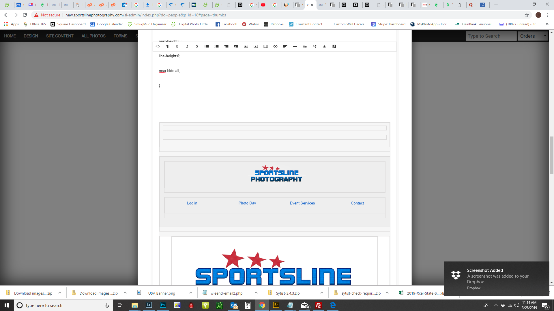
The style of the HTML emails is in Settings -> Default Emails -> Email Wrapper tab.
To add CSS to individual emails, you would have to click the < > HTML icon in the editor, but it probably won't work.
To add CSS to individual emails, you would have to click the < > HTML icon in the editor, but it probably won't work.
Tim Grissett, DIA - PicturesPro.com
My Email Address: info@picturespro.com
My Email Address: info@picturespro.com
Please log in or Create an account to post or reply to topics.

Loading more pages