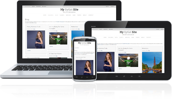
Responsive Design
Sytist has a responsive design which adjusts to the viewer's screen resolution. So no matter what device the visitor is using (computer, tablet, mobile), it looks good.
Sytist has 20 themes to choose from to get you started. These themes are basically a collection of colors, fonts and placement of menu. With the built-in theme editor you can easily edit the themes to fit your taste.
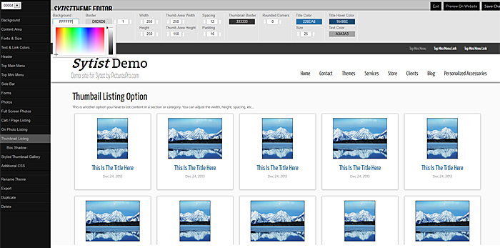
Theme editor
With the built-in theme editor, you can easily adjust your theme to your liking.
You have a ton of design options like changing the colors of the backgrounds & text, select from hundreds of Google Fonts, placement of the menu, add box shadows, optional side bar and much more.
When using the theme editor, you can a real-time preview of your design in the preview area.
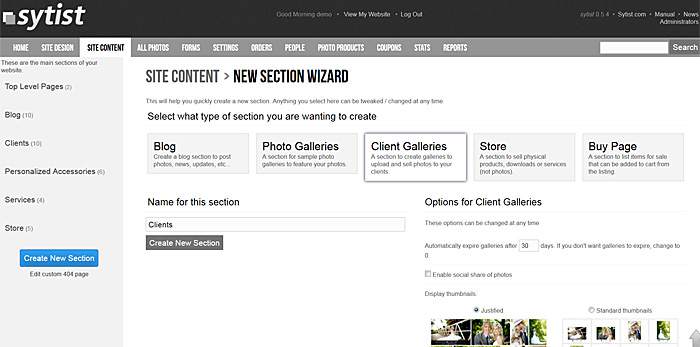
Creating Sections & Managing Content
When Sytist is installed, it is a clean slate. You create what sections and pages you want to have on your website. With the new section wizard, you can quickly create sections like a blog, albums, client galleries and more. Within each section you can chose how your pages is listed and displayed.
Adding Pages
Adding pages is as easy and filling in the blanks and clicking save.
Forms
Create contact forms for your visitors to fill out and those results are emailed to you.
Share & Comment Options
Add social sharing to your pages (Facebook, Pinterest, Twitter, etc...) and also the option for visitors to comment on your pages.
Search Engine Friendly
When creating sections & pages, it creates search engine friendly URLs & metadata.