To post a new support question, click the Post New Topic button below.
Current Version: 4.9.1 | Sytist Manual | Common Issues | Feature Requests
Please log in or Create an account to post or reply to topics.
You will still receive notifications of replies to topics you are part of even if you do not subscribe to new topic emails.
Content Pushed To Left
D
David Coxsell
149 posts
Mon Oct 22, 18 5:30 PM CST
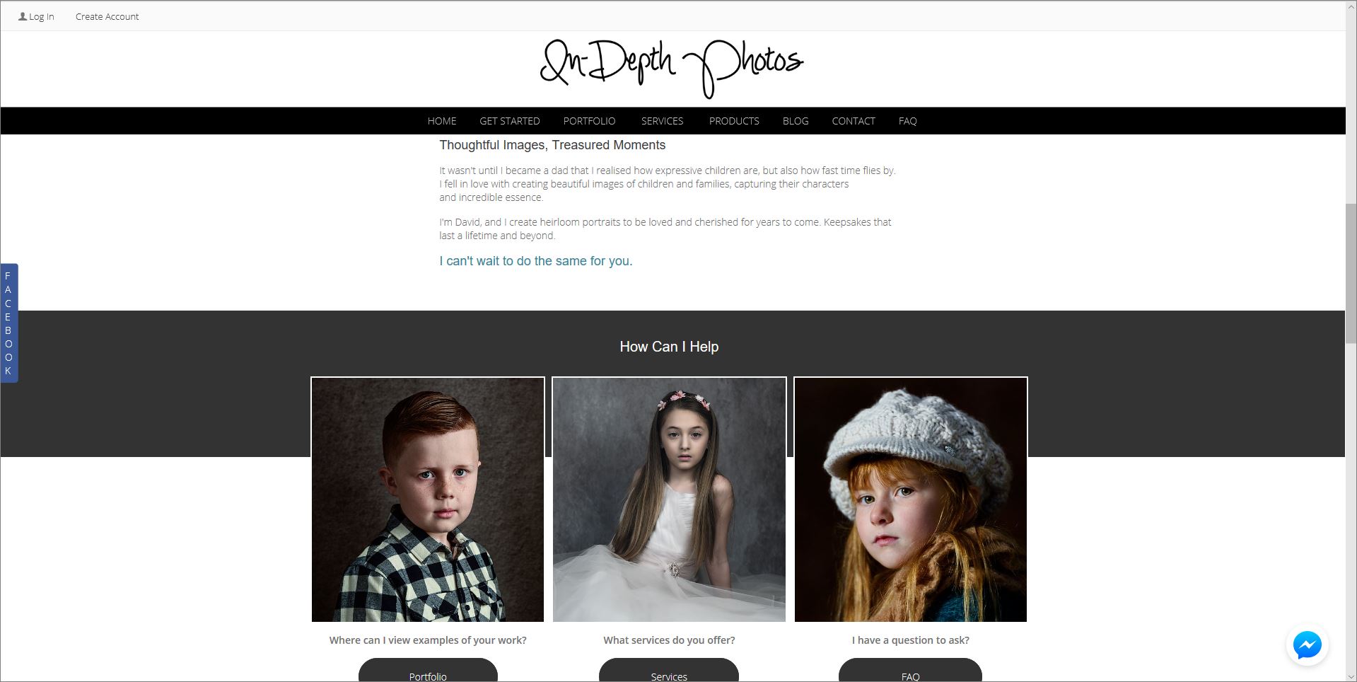
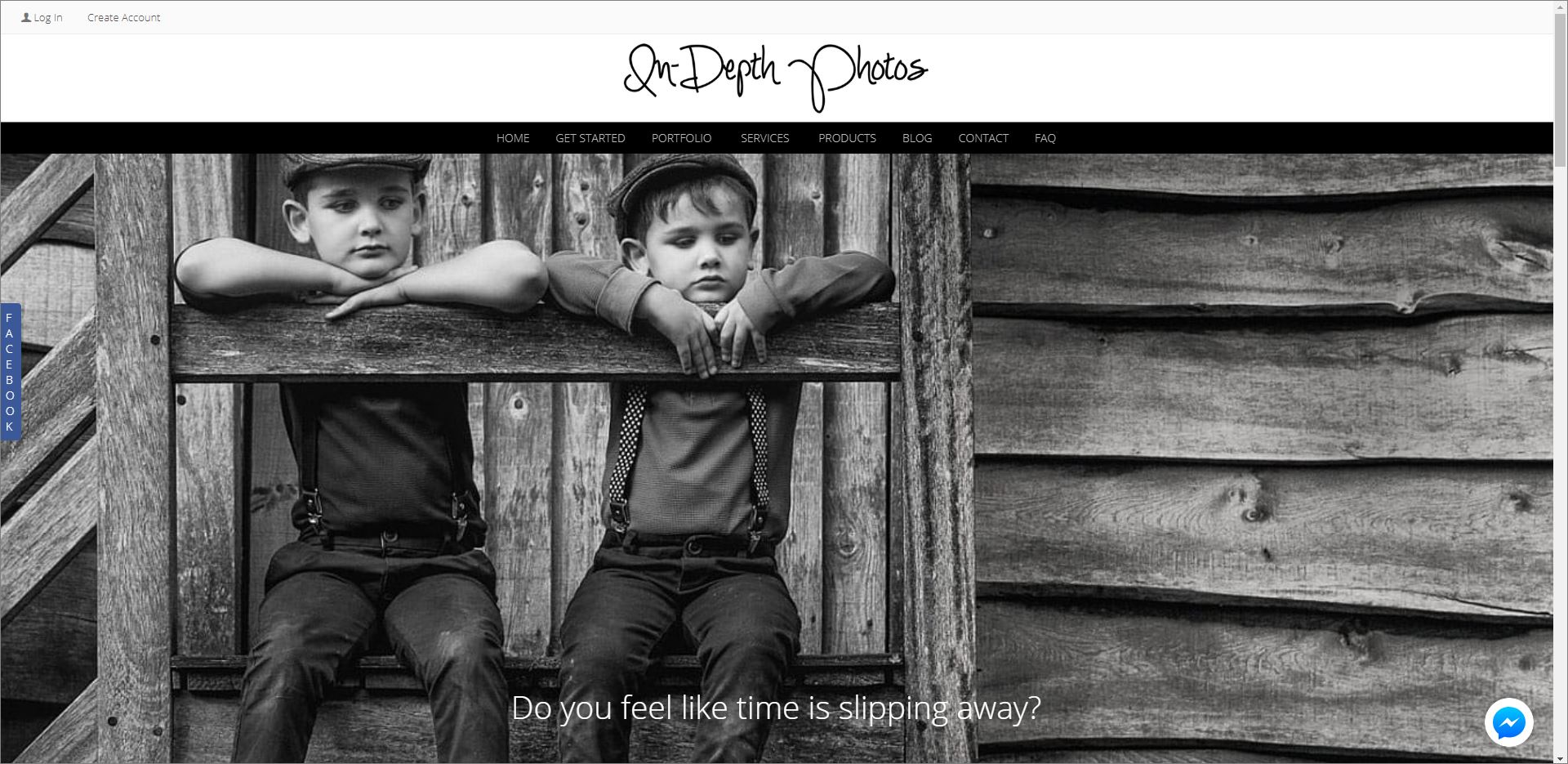
I have recently upgraded and have just noticed that all my content other than menu is no longer 100% the width of the page. It seems top have been pushed to the left slighly by the scroll bar.
How can I fix this please?
How can I fix this please?
Tim - PicturesPro.com
16,207 posts
(admin)
Tue Oct 23, 18 5:06 AM CST
To me, on the computer it looks fine.
But the pages on the phone are squished because the logo is not resizing and causing that. What is best is to have a separate/smaller logo to use on mobile.
Create a smaller version of your logo and in Design -> Header & footer, click the mobile header tab and upload it there:
https://www.picturespro.com/sytist-manual/articles/making-sure-your-header-logo-fits-mobile-screens/
Tim Grissett, DIA - PicturesPro.com
My Email Address: info@picturespro.com
My Email Address: info@picturespro.com
D
David Coxsell
149 posts
Tue Oct 23, 18 8:03 AM CST
I do have a smaller logo for mobile version. The content has been pushed over since I updated so bassically anything I have created in the page designer is no longer 100% width due to the scroll bar yet header menu is.
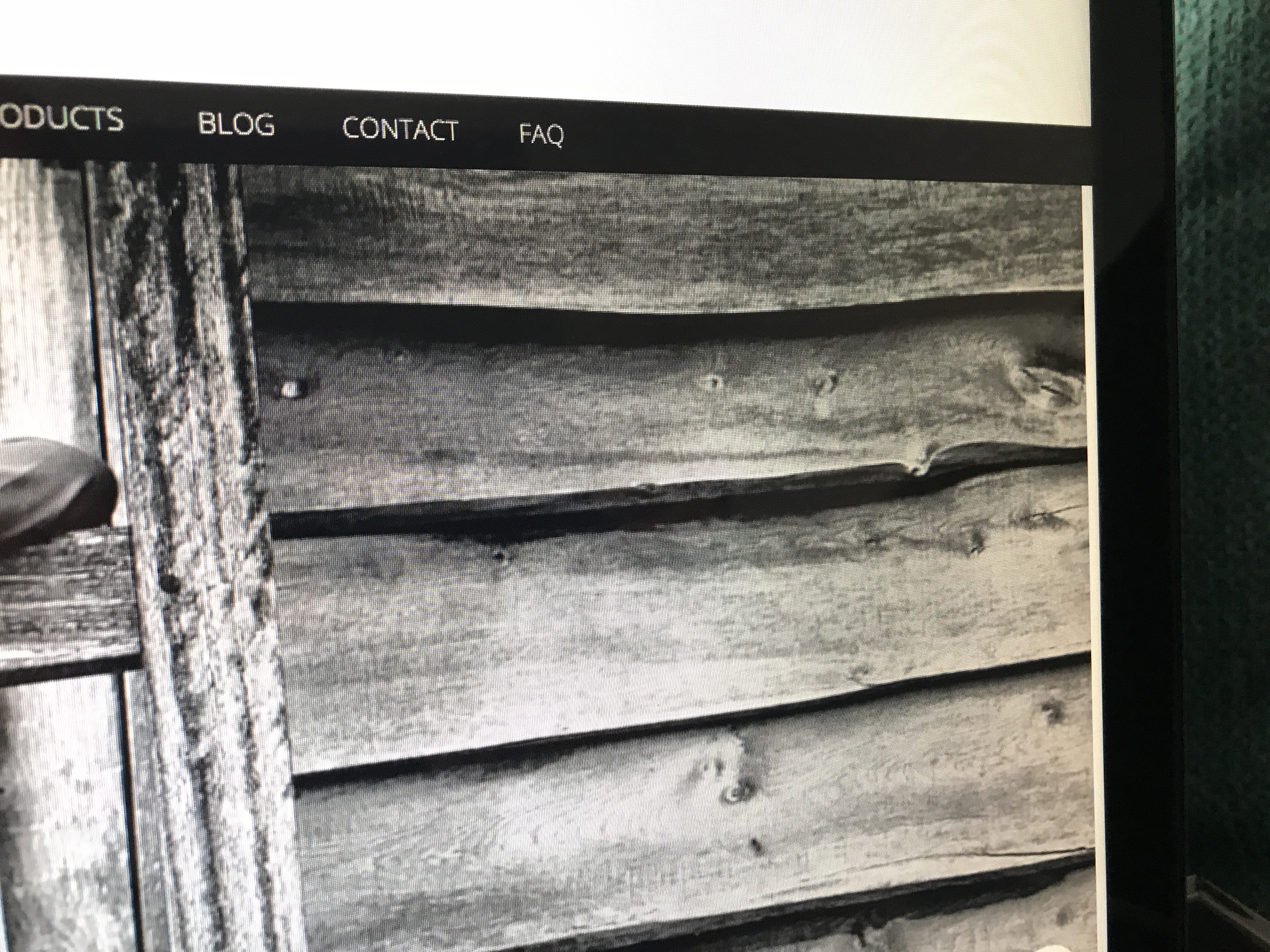
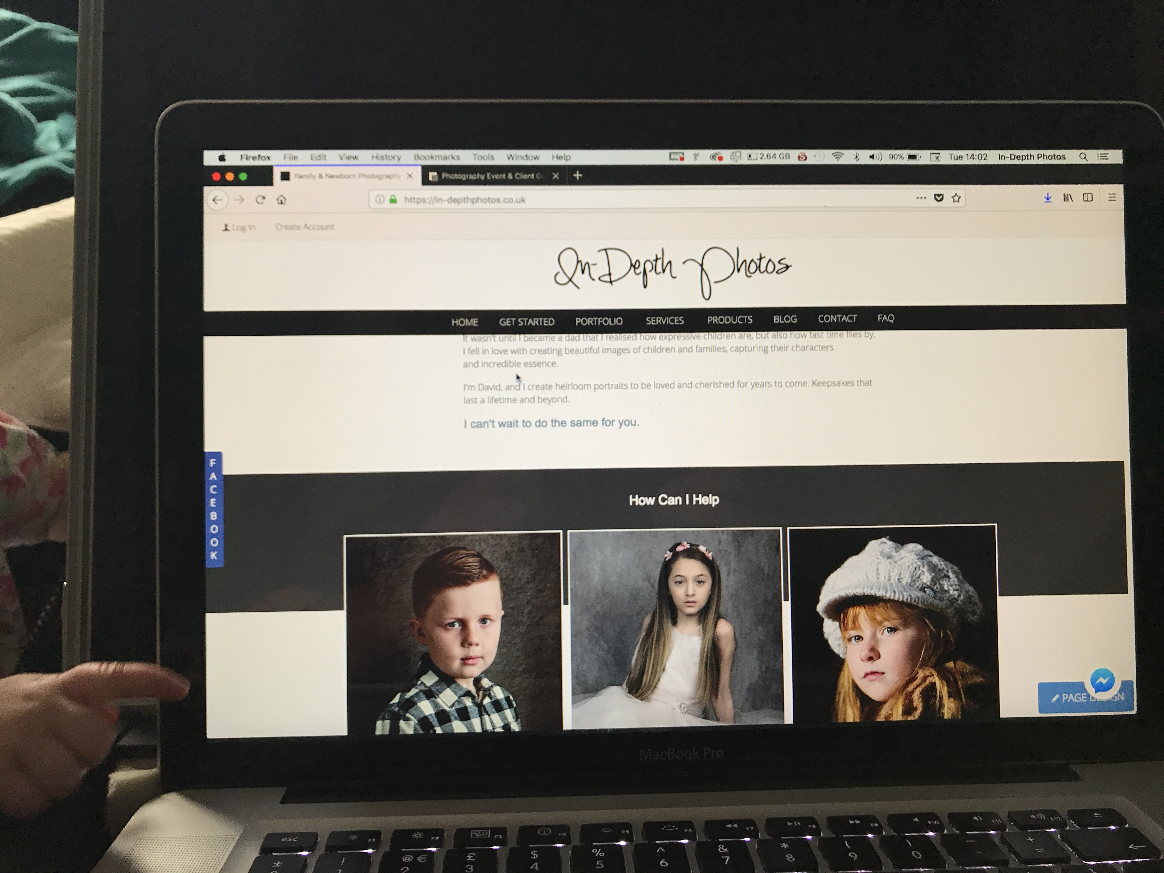
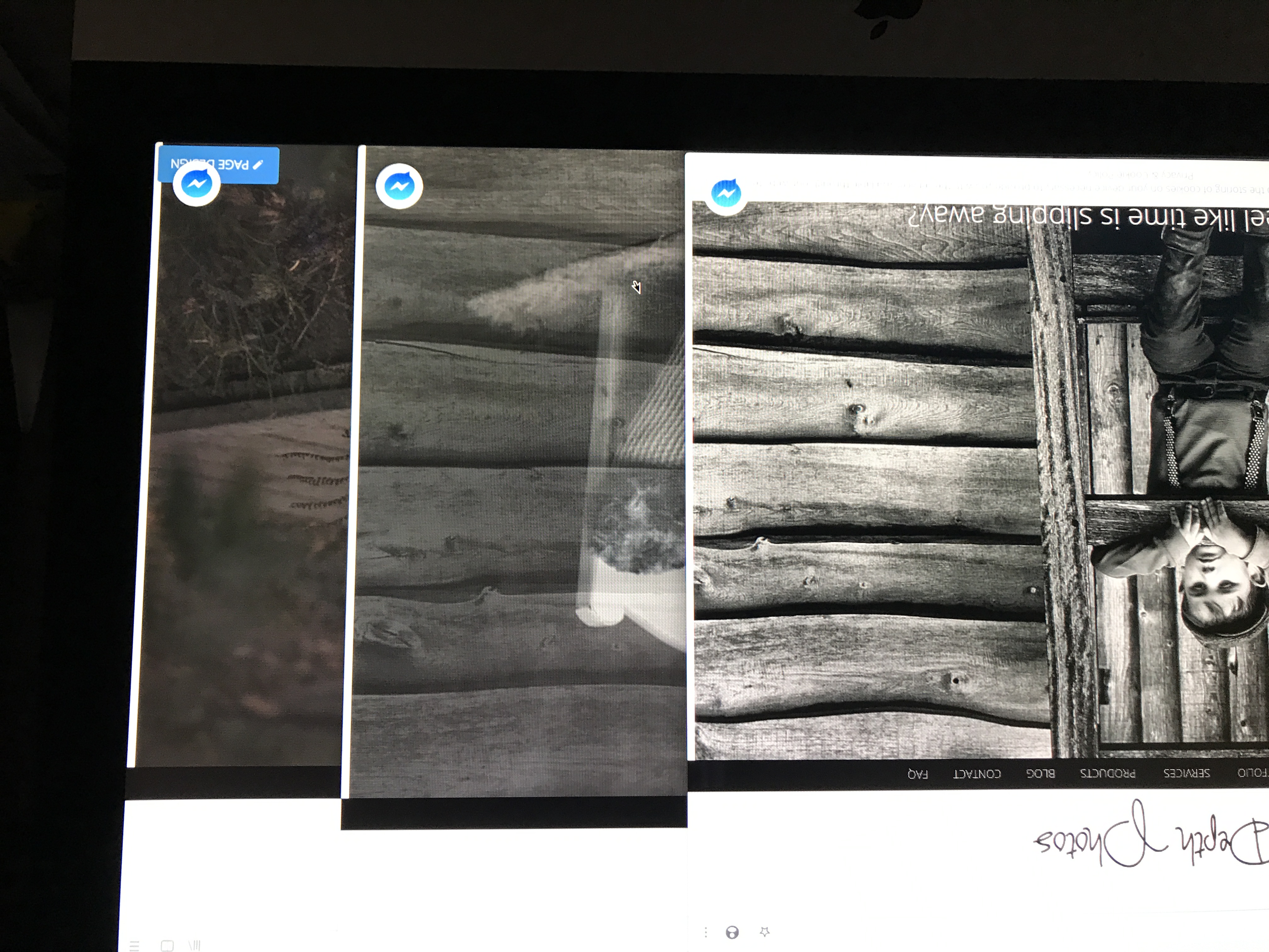
This forum won’t allow me to upload any images from my Mac for some reason so photographed the screen in my own site and sytist homepage as it is the same there. Note white edge on right side.
I have tried this in Firefox and Safari.
This forum won’t allow me to upload any images from my Mac for some reason so photographed the screen in my own site and sytist homepage as it is the same there. Note white edge on right side.
I have tried this in Firefox and Safari.
Attached Photos

Tim - PicturesPro.com
16,207 posts
(admin)
Tue Oct 23, 18 10:51 AM CST
Maybe it is something specific with your browser. Attached are screenshots from 4 different browsers: Chrome, Firefox, Edge and Opera. I don't see the same thing. Does it look the same in different browsers to you?
Attached Photos


Tim Grissett, DIA - PicturesPro.com
My Email Address: info@picturespro.com
My Email Address: info@picturespro.com
D
David Coxsell
149 posts
Wed Oct 31, 18 6:55 AM CST
Sorry for the delayed reply.
It’s the same for me across all browsers.
Chrome Safari and Firefox in the pics attached.
However I have noticed that your scroll bar is solid and not transparent like mine. The scroll display only shows if I hover over it or scroll via the mouse. Hoping you can see this in the second image.
I’m going to assume this maybe an iOS issue as it’s the same on my iPhone.
Attached Photos
D
David Coxsell
149 posts
Wed Oct 31, 18 3:57 PM CST
Hi Tim,
I think I figured out the issue as looking good on my browsers now.
I needed to overide the css for .width100vw
Changed
width: calc(100VW - 9px); to width: calc(100VW);
Is there a way I could set this for just browsers with transparent bars like IOS
Not sure how it effects other browsers at present.
Edited Wed Oct 31, 18 3:57 PM by David Coxsell
Tim - PicturesPro.com
16,207 posts
(admin)
Thu Nov 01, 18 10:07 AM CST
I don't know if there is a true way to apply CSS for specific browsers. You will need to do some searching on it,
https://stackoverflow.com/questions/32547370/is-there-a-way-to-set-any-style-for-a-specific-browser-in-css
https://www.google.com/search?q=css+browser+specific
https://stackoverflow.com/questions/32547370/is-there-a-way-to-set-any-style-for-a-specific-browser-in-css
https://www.google.com/search?q=css+browser+specific
Tim Grissett, DIA - PicturesPro.com
My Email Address: info@picturespro.com
My Email Address: info@picturespro.com
Please log in or Create an account to post or reply to topics.

Loading more pages