To post a new support question, click the Post New Topic button below.
Current Version: 4.9.2 | Sytist Manual | Common Issues | Feature Requests
Please log in or Create an account to post or reply to topics.
You will still receive notifications of replies to topics you are part of even if you do not subscribe to new topic emails.
Ipad Header Display Half Hidden
M
Michael Martin
53 posts
Mon May 16, 22 8:15 AM CST
Hi
When viewing my website on an iPad in portrait orientation, half the header is hidden, presumably by the mobile menu. In the landscape position, it is fine as per desktop, the mobile header/menu works just fine on an iPhone too. How can I solve this? It makes no difference using Safari or Chrome.
When viewing my website on an iPad in portrait orientation, half the header is hidden, presumably by the mobile menu. In the landscape position, it is fine as per desktop, the mobile header/menu works just fine on an iPhone too. How can I solve this? It makes no difference using Safari or Chrome.
Tim - PicturesPro.com
16,247 posts
(admin)
Mon May 16, 22 1:03 PM CST
Please post a screenshot of your issue.
Tim Grissett, DIA - PicturesPro.com
My Email Address: info@picturespro.com
My Email Address: info@picturespro.com
M
Michael Martin
53 posts
Mon May 16, 22 1:15 PM CST
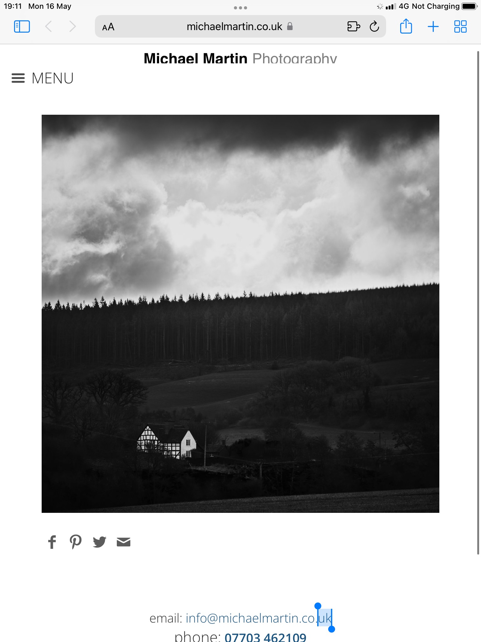
Attached Photos
Tim - PicturesPro.com
16,247 posts
(admin)
Mon May 16, 22 1:18 PM CST
Design -> Edit My Theme -> Header -> "Mobile Height". Enter a value there. Start with 100, save and check
Tim Grissett, DIA - PicturesPro.com
My Email Address: info@picturespro.com
My Email Address: info@picturespro.com
M
Michael Martin
53 posts
Mon May 16, 22 1:38 PM CST
Gone all the way up to 300 and it makes no difference for iPad. It is fine on the phone.
Tim - PicturesPro.com
16,247 posts
(admin)
Tue May 17, 22 3:57 AM CST
Maybe try increasing the main header size.
Tim Grissett, DIA - PicturesPro.com
My Email Address: info@picturespro.com
My Email Address: info@picturespro.com
Please log in or Create an account to post or reply to topics.

Loading more pages