To post a new support question, click the Post New Topic button below.
Current Version: 4.9.2 | Sytist Manual | Common Issues | Feature Requests
Please log in or Create an account to post or reply to topics.
You will still receive notifications of replies to topics you are part of even if you do not subscribe to new topic emails.
Mobile Home Page Looks Bad
p
pierre chiha
89 posts
Thu Jan 11, 18 3:58 PM CST
Hi Tim,
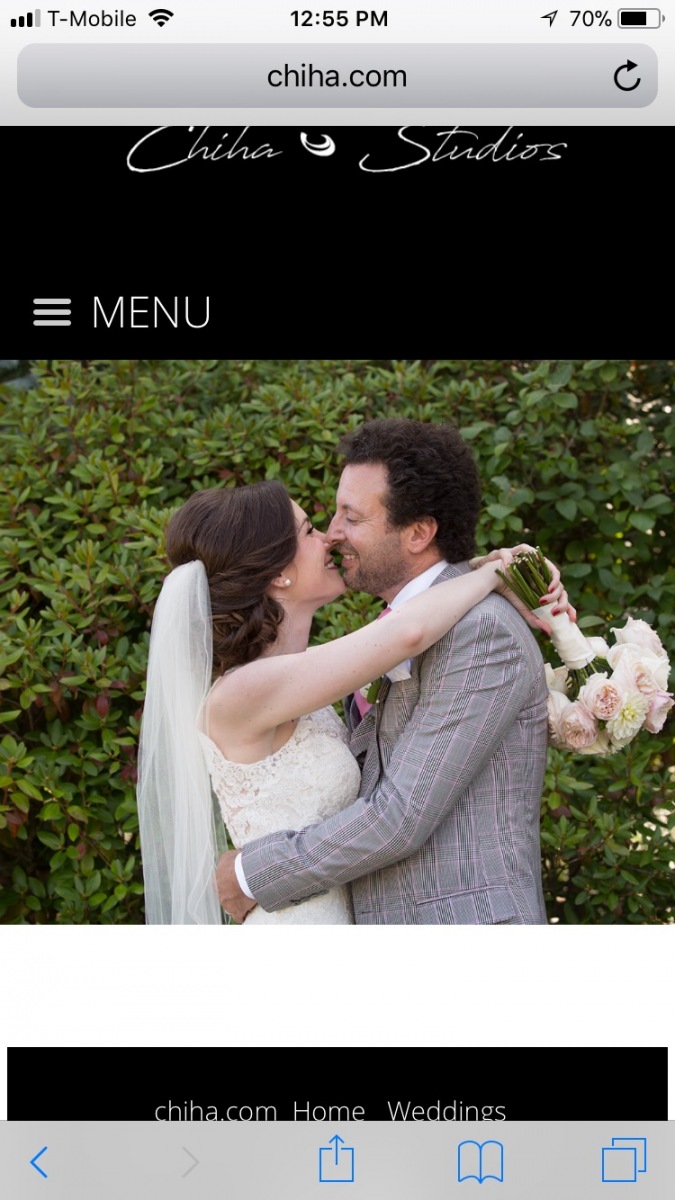
I'm wondering why the photos on my home page for Chiha.com on the mobile version look terrible. They're totally chopped off and often don't even see the subject in the photo.
Obviously I picked photos that look great formatted for desktop. Is there a way to have a different version of my homepage strictly for mobile? Or to at least reposition the photos for mobile version?
What can I do? I don't want to just 'pick a photo that works for both'
Tim - PicturesPro.com
16,247 posts
(admin)
Fri Jan 12, 18 4:42 AM CST
You are using a full-screen billboard in which the photo fills the container / viewing area. So yes, portions will be cropped when viewing on mobile because the ratio of the screen the photo is filling is different.
Something you can try is go to Design -> Edit My Theme, click additonal CSS in the left menu and add this code
@media (max-width: 800px) {
#neatbbslides { height: 50VH !important; }
}
This will make it so it only fills the top half of the screen on mobile (or when the screen resolution is under 800 pixels wide).
Tim Grissett, DIA - PicturesPro.com
My Email Address: info@picturespro.com
My Email Address: info@picturespro.com
p
pierre chiha
89 posts
Fri Jan 12, 18 12:06 PM CST
Ok... a little better but why is there that white gap between the photo and the footer? Can I eliminate that? And how do I make the studio name bigger/fill the screen more with less gap between the name and the menu bar??
Attached Photos
Tim - PicturesPro.com
16,247 posts
(admin)
Sun Jan 14, 18 9:02 AM CST
The white gap is where content would normally display. But since there is no content, it is just blank. I tried everything I could think of to change that just for the home page but I don't have a solution for you.
For the logo on mobile, you can replace the code I posted above with the following
@media (max-width: 800px) {
#neatbbslides { height: 50VH !important; }
#header img { margin-top: 24px; }
}
You may have to adjust the 24 pixel value above.
For the logo on mobile, you can replace the code I posted above with the following
@media (max-width: 800px) {
#neatbbslides { height: 50VH !important; }
#header img { margin-top: 24px; }
}
You may have to adjust the 24 pixel value above.
Tim Grissett, DIA - PicturesPro.com
My Email Address: info@picturespro.com
My Email Address: info@picturespro.com
p
pierre chiha
89 posts
Tue Jan 16, 18 4:42 PM CST
Is there a way to have just the home page background color black?
How do I add a tag line under my main logo?
How do I add a tag line under my main logo?
Tim - PicturesPro.com
16,247 posts
(admin)
Wed Jan 17, 18 7:26 AM CST
Site Content -> Manage Home Page
Click the Video section and in the video embed area add this code to make the background black
<style>
html,body,#page-wrapper,#main_container { background: #000000; }
</style>
How do I add a tag line under my main logo?
Design -> Header & Footer and type it in under your logo.
Click the Video section and in the video embed area add this code to make the background black
<style>
html,body,#page-wrapper,#main_container { background: #000000; }
</style>
How do I add a tag line under my main logo?
Design -> Header & Footer and type it in under your logo.
Tim Grissett, DIA - PicturesPro.com
My Email Address: info@picturespro.com
My Email Address: info@picturespro.com
p
pierre chiha
89 posts
Wed Jan 24, 18 9:33 AM CST
Ok I tried to fix the same mobile formatting issue of the homepage on Pierre.com with the additional css but it didn't quite work- it made the photos fit better when looking vertical, but still chopped off a little... why? And now when I switch back to horizontal mode on my phone the container's height is tiny and the photos are chopped off in a skinny rectangle.... why!!
Additionally, I'm trying to fix the SAME formatting issue on the Bar Mitzvah page where I'm using the advanced page designer with a full page slideshow. The slideshow fits neither vertically nor horizontally on mobile. Even the row styling is set to 'fit screen width' why!!!
Additionally, I'm trying to fix the SAME formatting issue on the Bar Mitzvah page where I'm using the advanced page designer with a full page slideshow. The slideshow fits neither vertically nor horizontally on mobile. Even the row styling is set to 'fit screen width' why!!!
Please log in or Create an account to post or reply to topics.

Loading more pages