To post a new support question, click the Post New Topic button below.
Current Version: 4.9.1 | Sytist Manual | Common Issues | Feature Requests
Please log in or Create an account to post or reply to topics.
You will still receive notifications of replies to topics you are part of even if you do not subscribe to new topic emails.
Lost Business
Michael Leenheer
493 posts
Thu Sep 21, 17 11:22 PM CST
I had a client call today who was very surprised at how many products were available on the desktop site that could not be found on her tablet.
She had placed an order from her iPad (newer model, high-res screen but it was probably in portrait orientation) and then looked again later from her computer. She was upset at me because the other tabs "weren't available before and I would have picked from those options instead". The cart and the options didn't change at all - just the device she was using changed. We ended up on the phone for 45 minutes making product swaps.
Now, I recognize that this is partly a user issue, but it also is a site design issue - the product tabs scroll off the top of a mobile display very quickly and they don't really stand out as something important with "cool stuff inside, click here". The "Lost business" title is because I've noticed that as more people are accessing our site on mobile, the sales per visit are dropping (i.e. we sell much more from the desktop site).
Is there a way to use the pop-up to give a warning about the cart being harder to use on mobile? I'd like to have something appear when people view the site on their phone that says "to order use a computer" so that they can more easily notice that there are tabs at the top (they scroll off the screen pretty fast) and/or give a link to "VIEW DESKTOP SITE" and forget all the auto-resizing and auto-reformatting.
For an alternate (or conjunctive) solution, the tabs might have more highlighting or be available at top AND bottom of each tab page, I am sure there are other design options by which it can be highlighted as well.
Michael Leenheer || My Sytist: https://subphoto.ca/client_galleries/demo01/
Tim - PicturesPro.com
16,209 posts
(admin)
Fri Sep 22, 17 7:04 AM CST
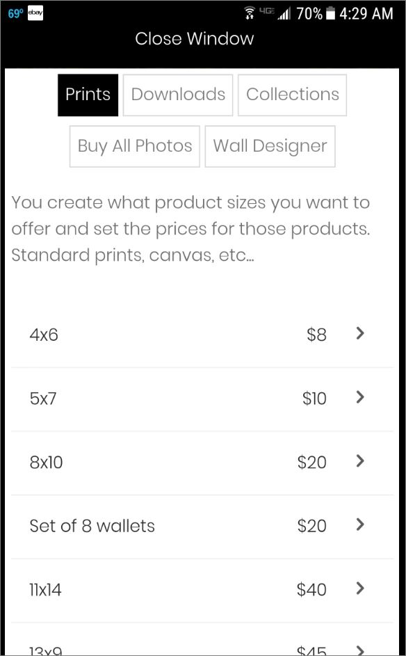
Here is a screen shot of the demo from my phone. The product groups are clearly at the top of the screen and don't scroll off until you scroll. How is yours different?
Attached Photos
Tim Grissett, DIA - PicturesPro.com
My Email Address: info@picturespro.com
My Email Address: info@picturespro.com
Michael Leenheer
493 posts
Mon Sep 25, 17 11:31 PM CST
It isn't a lot different for me; it's just that for some clients that small amount of scrolling is enough to hide the tab options or they don't even recognize those as buttons. The specific client I'm describing was very nice and seemed intelligent but still was confused by the differences between her laptop and the tablet view for ordering; she's not entirely unique among my clientele though.
Like I said, some of that is a user problem and many people still buy photos with the design 'as-is' and don't complain. These ideas would help bring the site from "simple" to "granny friendly" I think. I may revise the text part to say "CLICK ABOVE FOR MORE" or something just to accommodate those folks.
Like I said, some of that is a user problem and many people still buy photos with the design 'as-is' and don't complain. These ideas would help bring the site from "simple" to "granny friendly" I think. I may revise the text part to say "CLICK ABOVE FOR MORE" or something just to accommodate those folks.
Michael Leenheer || My Sytist: https://subphoto.ca/client_galleries/demo01/
Christina Kafkakis
82 posts
Tue Sep 26, 17 1:41 PM CST
I agree. So many of my clients comment on this.
M
M Davis
324 posts
Tue Sep 26, 17 8:07 PM CST
I would think having an instructional guide or video how to use, might be helpful. I have text that I use on the splash page with a PDF downloadable link of the same. True, the granny generation is not as internet savy as millennials, but providing simple instructions there's no excuse. Unless they don't read them.
M Davis
Michael Leenheer
493 posts
Wed Sep 27, 17 3:40 PM CST
People have very short attention spans nowadays. While a PDF instruction manual would be read by some, there's a lot of people who don't have the patience and just give up or 'click away' without making a purchase.
While I agree that it's sorta annoying that this happens, ultimately we want to make our products as easy and simple to purchase as possible. "Granny-proof" design means more sales in the end.
On the web version, the tabs "persist" - they stay visible - while on the mobile version they don't. That's why it would be nice to have the option to switch to "desktop" view for mobile/tablet clients - unless you can think of a better way to do it.
Edited Wed Sep 27, 17 3:41 PM by Michael Leenheer
Michael Leenheer || My Sytist: https://subphoto.ca/client_galleries/demo01/
Tim - PicturesPro.com
16,209 posts
(admin)
Thu Sep 28, 17 8:47 AM CST
The tabs don't "persist" on desktop. They are exactly the same on desktop and mobile. There is just more real estate on desktop.
Tim Grissett, DIA - PicturesPro.com
My Email Address: info@picturespro.com
My Email Address: info@picturespro.com
Michael Leenheer
493 posts
Fri Sep 29, 17 5:46 PM CST
True enough; but you see my point I trust? I'm not 100% sure the best solution but I think anyone using a tablet should be given a popup saying "use your tablet horizontally" and then be given a desktop site instead of a mobile one.
Michael Leenheer || My Sytist: https://subphoto.ca/client_galleries/demo01/
Please log in or Create an account to post or reply to topics.

Loading more pages